For Rem Koolhaas, a diagram is a tool for bringing “an aura of objectivity to the inherently subjective nature of design”
The Diagrams exhibition in Venice highlighted the importance of diagrams and information visualization in architectural design – and especially in architectural communication.

Diagrams
until 24.11.2025
Fondazione Prada, Venice
At the Venice Architecture Biennale this year, one of the most visible curatorial projects outside the actual biennale program was the exhibition Diagrams at Fondazione Prada, curated by AMO/OMA. Arriving by the airport you would hardly be able to exit without seeing the black and white posters advertising this exhibition, calling attention to the purely graphic aesthetic of OMA’s ribbon diagram design, with the timeline subject left abstract. On the opening pages of Rem Koolhaas’ opus S, M, L, XL (1995) thesame ribbon format isjuxtaposedwith casual office shots.
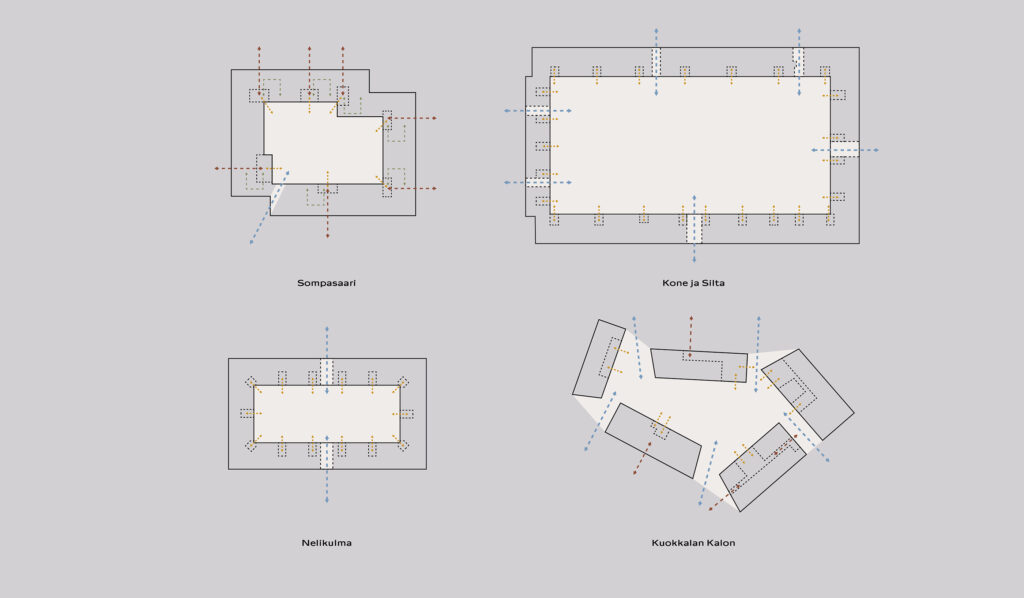
The diagram as part of the design process relates to a pragmatic design approach in contemporary Dutch architecture, in which Koolhaas (b. 1944) was the pioneering theorist and influential figure of his generation. Architects who started their careers at OMA and set up leading international firms, such as MVRDV and BIG, became known for using the same design method, which Bjarke Ingels, the founder of BIG, has called Information Driven Design, referring to the vast amount of different types of information architects deal with today.
Mapping out the complexities
Since the 1990s, as a result of free-market financial policies, deregulation and globalisation, design as a discipline took a more scientific approach towards socio-economic challenges, which had previously been the responsibility of government policies. The same today applies to pressing issues in relation with the climate crisis.
In this context, when on the other hand all kinds of technologies and solutions could be envisioned, for example BIM (Building Information Modeling), it is easy to see how the diagram became such a useful tool for mapping out and for seizing opportunities and emergent potentialities. Bjarke Ingels describes the complexity of the situation in his book Hot to Cold: an Odyssey of Architectural Adaptation (2021), looking at the wider responsibility, suggesting that architects have to be more in charge in considering both ecological and economic systems.
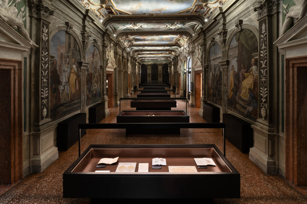
So you might expect that the exhibition at Fondazione Prada would be a showcase for this particular approach by Koolhaas and his firm OMA, and its theoretical foundation. Although this was the starting point for the exhibition, as the chief curator from OMA, architect Giulio Margheri explained, it turned out to be something much broader in scope. “The exhibition became a much wider study on the history of information through the diagrammatic form, rather than focusing on information as part of the design process.”
While bringing forth the various visual styles of this graphic method for analysis and communication, the exhibition’s narrative simultaneously evokes the complexity in contemporary culture. The philosophical notion of “abstract machines” borrowed from the theory of Gilles Deleuze and Felix Guattari, resonates as a regime of signs also at the heart of architectural practice, where politics, economics, science, ecology, arts and cosmology are intertwined. There you can also see the relevance of the diagram, when technological systems have mechanised a certain level of abstraction in reality. French architect and theorist Antoine Picon has referred to the diagram itself as an abstract machine, signifying the scientific rigour in the design process. As an example he mentions the ’deep planning’ method of Dutch firm UN Studio, in which the objective is to integrate as much data as possible.
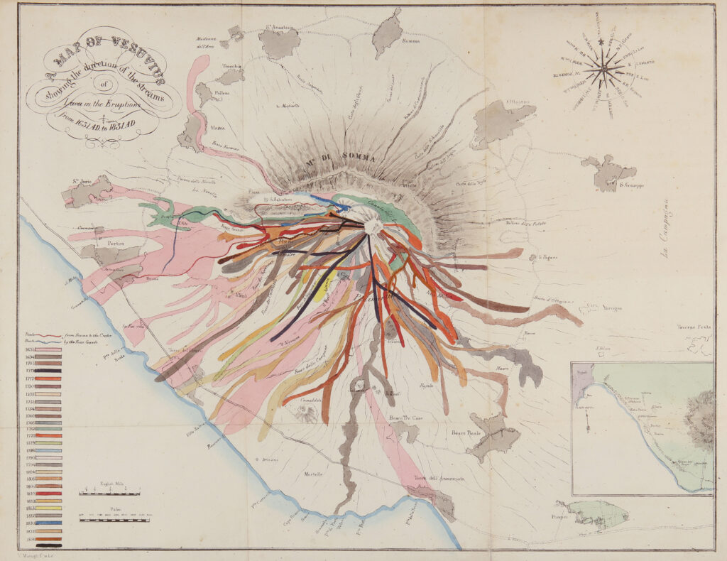
Diagram signifies potentialities
While Koolhaas’ theories have been preoccupied mostly with masterplanning and building on the scale of the megastructure, it is easy to understand the need for carefully analysing a multitude of existing and possible future scenarios as part of the design process. As the exhibition demonstrates, an underlying rhetoric is often built into the diagram format, which in parallel can be understood as a strategic method of communication in any architectural proposal or project in development. Koolhaas brings up the hypothetic aspect of architectural design, at least in his work, stating that the diagram can be a tool for bringing “an aura of objectivity to the inherently subjective nature of design” according to him on the press release. Koolhaas’ narrative and analytic sensibility, in which the diagram stands for effective communication, have certainly contributed to the kind of buildings that OMA has been able to conceive. Hence the diagram has been a crucial device for explaining, analysing and ordering the amount of data needed for setting the parameters for very large programmatic projects for which OMA is known for. In these kinds of projects the explanatory power of a well-thought diagram can have a strong impact for convincing a client or a competition jury.
In large programmatic projects the explanatory power of a well-thought diagram can have a strong impact for convincing a client or a competition jury.
Architect Julien Monfort, who worked for OMA in the 1990s for several years and runs his own practice now and teaches at the École Nationale Supérieure d’Architecture in Marseille, sees the ongoing value of the diagram as part of the creative process.
“In a very chaotic and prolific process of production, which qualifies offices like OMA, where every architect produces several models each day, the diagram remains central in the design process,” Monfort describes. “It signifies an organisational quality in an abstract way, and leaves open as many strategies, or design proposals to achieve this intention.” It is hence a tool that helps throughout each phase of conception and management of a project Monfort points out.
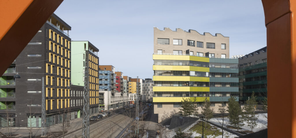
“Diagrams propose a spatial organisation device of programmatic entities and all kinds of technical and architectural issues to be then explored. They also allow to invent, or permit new uses by the combination or juxtaposition of different entities.” As an early example of a multi-use organisational diagram project Monfort mentions the Congrexpo in Lille (OMA, 1994), to which could be added examples of programmatic densification such as the hybrid market hall Markthall (MVRDV 2014) in Rotterdam or even the Amager Resource Centre (BIG 2018) in Copenhagen, which combines a power plant with a skiing slope.
As the exhibition brings forth in its thorough historic overview, the diagram was also a tool for architects of the modern movement, in particular for analysing and explaining climatic and atmospheric conditions. There are hand drawn sketches for ventilation and lighting design by Le Corbusier, juxtaposed to contemporary performance graphs made with digital technology and sophisticated analytic methods. As an example, architect Philippe Rahm’s climatic diagrams explore and represent the dynamic elements such as temperature and wind interacting with buildings, of which some have been part of collaborations with OMA.
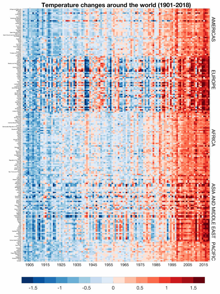
Created by Professor Ed Hawkins for the BBC, this diagram uses color to represent climate change in different areas of the world in the last century. As the time dimension approaches the present day, the temperatures become higher relative to the annual average. BBC published the image in 21.6.2019. Source: BBC News
Past or future tool?
In Venice at the opening week of the Biennale, Winy Maas, one of the founders of MVRDV, initially questioned the relevance of the thematic of the diagram as an exhibition topic (which he hadn’t yet seen). MVRDV is known for their datascape design philosophy, in which the diagram has featured as a central device for data analysis, but since 2010 their design process of dealing with data has been streamlined with BIM. Although commenting on the use of the diagram as belonging to a design thinking of the 1990s, Winy Maas nevertheless agreed on an enduring significance of the diagram as a tool for argumentation: “How you communicate the project to the world – it’s explanatory and it’s research”. Therefore it is no surprise seeing diagrams to be widely included in the MVRDV press packs for most of their projects. MVRDV has introduced bold hybrid programmes and fearless typological transformations within the existing dynamics of the urban fabric, which would require deep analysis in order to be successful. In such radical projects as the Markthall or Depot Boijmans van Beuningen museum, where typologies are mixed, we can see how communication and analysis are essential for the creative potential to be realised.
It can hence be understood that the power of visual synthesis of the diagram is both a strategy for communication, while simultaneously conveying relations and providing creative solutions. For large scale projects in particular the diagram seems to be a highly effective tool, and with artificial intelligence, we can ask to what extent will the method of synthesis be automated in the future? “Well, definitely there are some processes, that are more automated compared to when I started this work,” the Diagrams curator Marghieri says. “There are technologies that are constantly evolving, and supporting and simplifying some processes. For a designer these are tools, but ultimately you need to orchestrate these processes.”
Antoine Picon has brought up some concern for cynicism in the Dutch rationalist design method, as if creativity or expression might be lost, while pointing out that analysis has become identical to creation. According to Picon, the methods of deep planning and datascapes should be viewed in relation to free-market forces, where architects are aiming to extend the existing condition for something better, rather than providing a new utopian solution, as architects of the modern movement often envisioned. Today the existing conditions are more complex and should certainly be examined in depth, in order to better understand urban situations and needs for mapping out social, economic and ecological impacts of new projects. Although creative references, such as ‘Italian hill town’ borrowed from Alvar Aalto’s design vocabulary as an ideal for an organic system, might still be relevant for imagining the organisational principles of a megastructure, the real challenge is evaluating the multitude of connections, possibilities and impacts, where diagrams can be a useful tool.